The Format pane is a new entry in Excel 2013. It provides advanced formatting options in clean, shiny, new task panes and it is quite handy too.
Step 1 − Click on the Chart.
Step 2 − Select the chart element (e.g., data series, axes, or titles).
Step 3 − Right-click the chart element.
Step 4 − Click Format <chart element>. The new Format pane appears with options that are tailored for the selected chart element.
Format Axis
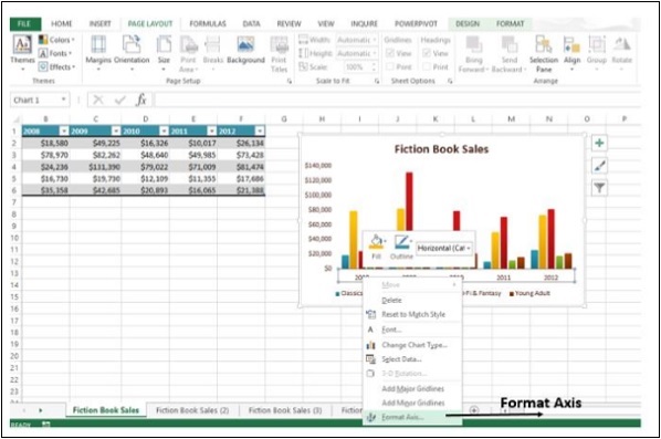
Step 1 − Select the chart axis.
Step 2 − Right-click the chart axis.
Step 3 − Click Format Axis. The Format Axis task pane appears as shown in the image below.
You can move or resize the task pane by clicking on the Task Pane Options to make working with it easier.
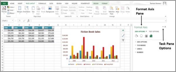
The small icons at the top of the pane are for more options.
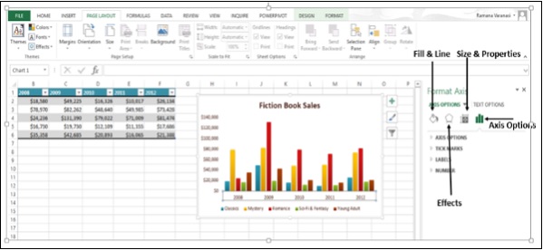
Step 4 − Click on Axis Options.
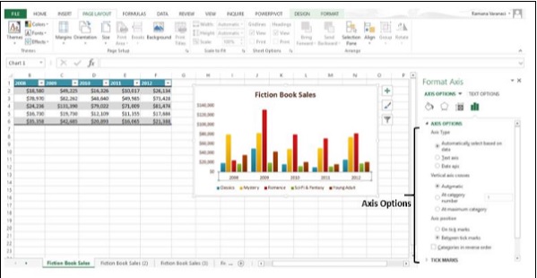
Step 5 − Select the required Axis Options. If you click on a different chart element, you will see that the task pane automatically updates to the new chart element.
Step 6 − Select the Chart Title.

Step 7 − Select the required options for the Title. You can format all the Chart Elements using the Format Task Pane as explained for Format Axis and Format Chart Title.
Provision for Combo Charts
There is a new button for combo charts in Excel 2013.
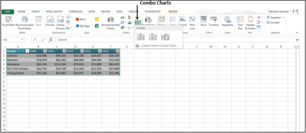
The following steps will show how to make a combo chart.
Step 1 − Select the Data.
Step 2 − Click on Combo Charts. As you scroll on the available Combo Charts, you will see the live preview of the chart. In addition, Excel displays guidance on the usage of that particular type of Combo Chart as shown in the image given below.
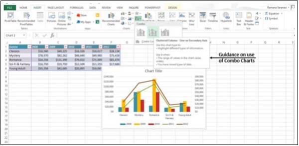
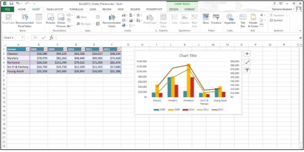
Step 3 − Select a Combo Chart in the way you want the data to be displayed. The Combo Chart will be displayed.
No comments:
Post a Comment