You can have simple Pie Chart Visualizations in Power View.
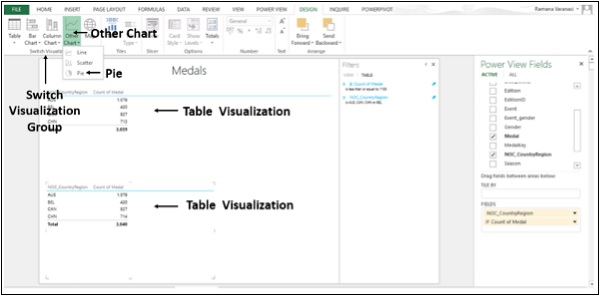
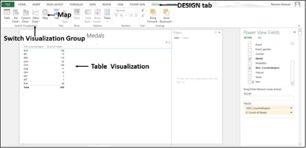
Step 1 − Click on the Table Visualization as shown below.
Step 2 − Click on Other Chart in the Switch Visualization group.
Step 3 − Click on Pie as shown in the image given below.
The Table Visualization converts into Pie Chart Visualization.
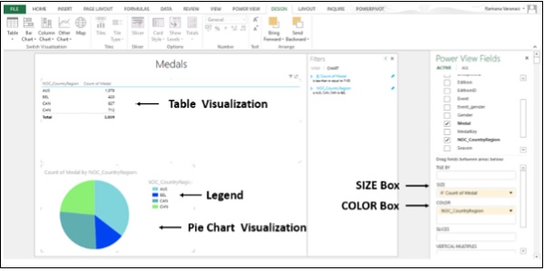
You now have a Simple Pie Chart Visualization wherein the count of Medals are shown by the Pie Size, and Countries by Colors. You can also make your Pie Chart Visualization sophisticated by adding more features. One such example is SLICES.
Step 1 − Add Field Gender to the Table above.
Step 2 − Click on Pie Chart Visualization.
Step 3 − Drag Field Gender in the Power View Fields List to the SLICES Box as shown below.
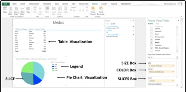
Now, with SLICES, you can visualize the count of Medals for men and for women in each country.
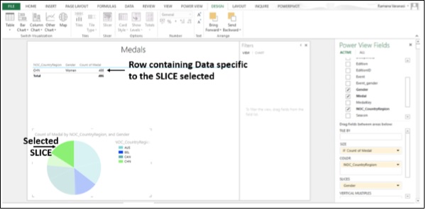
Step 4 − Click on a SLICE in the Pie Chart Visualization.
Step 5 − Only the specific row containing the data specific to the SLICE will be displayed in the TABLE VISUALIZATION above.
Bubble and Scatter Charts
You can use the Bubble and Scatter charts to display many related data in one chart. In Scatter charts, the x-axis displays one numeric field and the y-axis displays another, making it easy to see the relationship between the two values for all the items in the chart. In a Bubble Chart, a third numeric field controls the size of the data points.
Step 1 − Add one Category Field and one Numeric Field to the Table.
Step 2 − Click on Other Chart in the Switch Visualization group.
Step 3 − Click on Scatter.
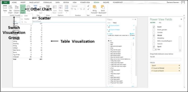
The Table Visualization converts into Scatter Chart Visualization. The Data points are little circles and all are of same size and same color. Category is in DETAILS Box.
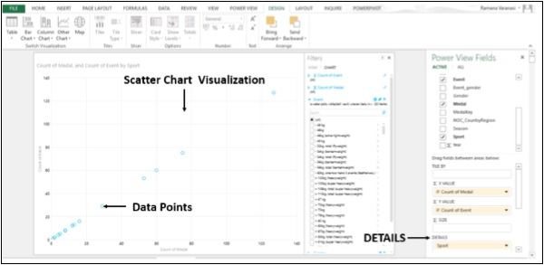
Step 4 − Drag Medal to Size.
Step 5 − Drag field NOC_CountryRegion to Σ X VALUE.
The Scatter Chart Visualization converts into Bubble Chart Visualization. The data points are circles of the size represented by the values of Data points. The color of the circles is the X VALUE and given in the Legend. The data labels are the Category Values.
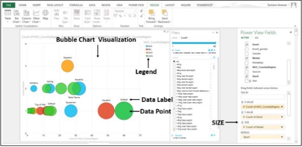
Step 6 − Drag the field NOC_CountryRegion to the COLOR Box. The bubbles will be colored by the values of the field in the COLOR box.
Step 7 − Drag the Year field to PLAY AXIS. A Time Line with Play button will be displayed below the Bubble Chart Visualization.
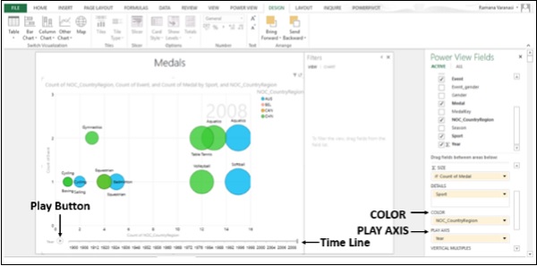
Step 8 − Click on the Play button. The bubbles travel, grow, and shrink to show how the values change based on the PLAY AXIS. You can pause at any point to study the data in more detail.
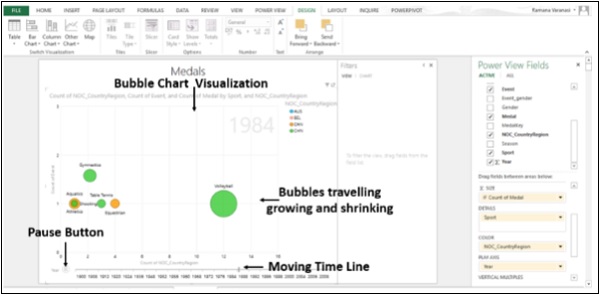
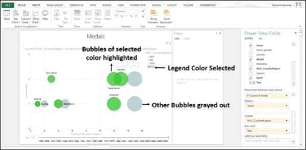
Step 9 − Click any color on the Legend. All the bubbles of that color will be highlighted and other bubbles will be grayed out.
Maps
You can use Maps to display your data in the context of geography. Maps in Power View use Bing map tiles, so you can zoom and pan as you would with any other Bing map. To make maps work, Power View has to send the data to Bing through a secured web connection for geocoding. So, it asks you to enable the content. Adding locations and fields places dots on the map. The larger the value, the bigger the dot. When you add a multivalue series, you get pie charts on the map, with the size of the pie chart showing the size of the total.
Step 1 − Drag a Geographic Field such as Country/Region, State/Province, or City from Power View Fields List to the table.
Step 2 − Drag a numeric field such as Count to the table.
Step 3 − Click on DESIGN tab on the ribbon.
Step 4 − Click on Map in the Switch Visualization group.
The Table Visualization converts into Map Visualization. Power View creates a map with a dot for every geographic location. The size of the dot is the value of the corresponding numeric field.
Step 5 − Click on a dot. The data, viz., the geographic location and the numeric information relating to the size of the dot will be displayed.
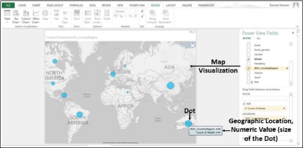
Step 6 − You can also verify that below the Power View Fields List, the Geographic field is in the Locations Box and Numeric Field is in the Σ SIZE Box.
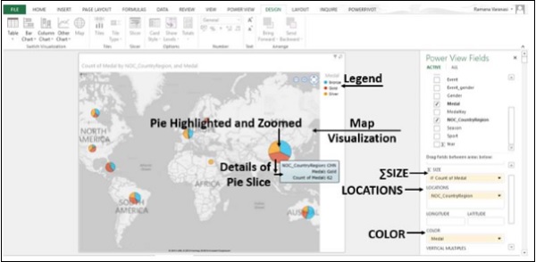
Step 7 − Drag Medal to COLOR Box. The Dots are converted into Pie Charts. Each Color in the Pie representing the category of the Medals.
Step 8 − Place the cursor on one of the Dots. The Dot gets highlighted and zoomed. The details of the Pie Slice are displayed.
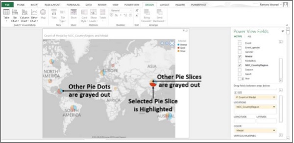
Step 9 − Place the cursor on one of the Dots and click on it. That Pie Slice is highlighted. The other Slices in the Pie and all other Pie Dots will gray out.
Multiples: A Set of Charts with the Same Axes
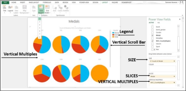
Multiples are a series of charts with identical X and Y axes. You can have Multiples arranged side by side, making it easy to compare many different values at the same time. Multiples are also called Trellis Charts.
Step 1 − Start with a Pie Chart. Click on the Pie Chart.
Step 2 − Drag a Field to Vertical Multiples.
Step 3 − Click on the LAYOUT tab on the ribbon.
Step 4 − Click on Grid Height and select a number.
Step 5 − Click on Grid Width and select a number.
Vertical Multiples expand across the available page width and then wrap down the page into the space available. If all the multiples do not fit in the available space, you get a vertical scroll bar.
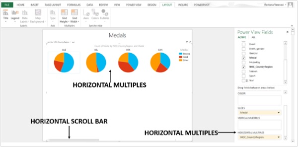
Step 6 − Drag the field in VERTICAL MULTIPLES to HORIZONTAL MULTIPLES. The horizontal multiples expand across the page. If all the multiples do not fit in the page width, you get a horizontal scroll bar.
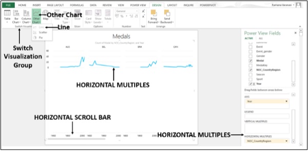
Step 7 − Click on Multiples.
Step 8 − Click on the DESIGN tab on the ribbon.
Step 9 − Click on Other Chart in the Switch Visualization group.
Step 10 − Click on Line. You have created Horizontal Multiples of the Line charts.
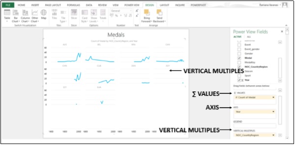
Step 11 − Drag the Field in HORIZONTAL MULTIPLES to VERTICAL MULTIPLES. You have created VERTICAL MULTIPLES of Line Charts.
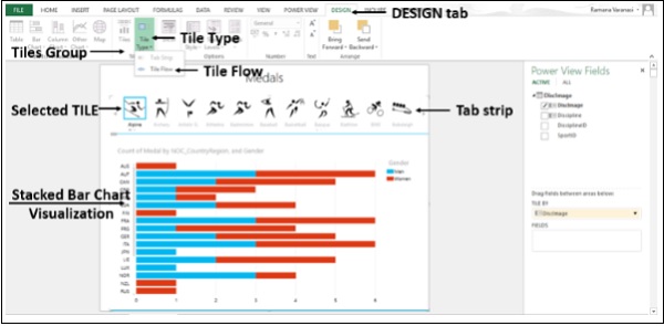
Visualization – Tiles
Tiles are containers with a dynamic navigation strip. You can convert a Table, Matrix or Chart to Tiles to present data interactively. Tiles filter the content inside the Tile to the value selected in the Tab Strip. You can have a single Tile for each possible field value so that if you click on that Tile, data specific to that Field is displayed.
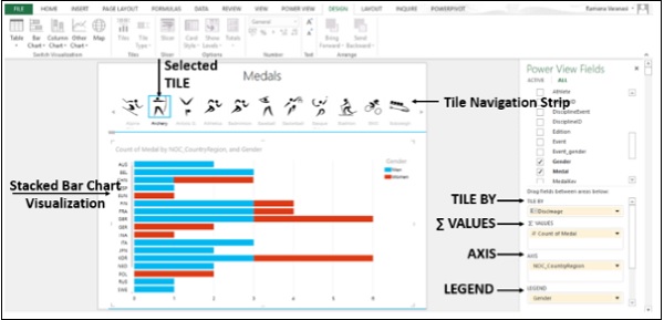
Step 1 − Drag the Field you want to use as your Tile from the Fields List and drop it in the Tile by box. The Tile Navigation Strip displays the Values for that Field.
Step 2 − Click the Tiles to move between the data for different Tiles. The data changes in the Stacked Bar Chart Visualization according to the selected Tile. All the content in the container is filtered by the selected Tile value.
The Tile container has two navigation strip types: tile flow and tab strip.
What you have created above is the tab strip. Tab strip displays the navigation strip across the top of the visualization.
Step 3 − Click on a Tile.
Step 4 − Click on the DESIGN tab on the ribbon.
Step 5 − Click on Tile Type in the Tiles group.
Step 6 − Click on Tile Flow.
The Tile flow displays the navigation strip across the bottom of the Visualization. The selected Tile is always centered.
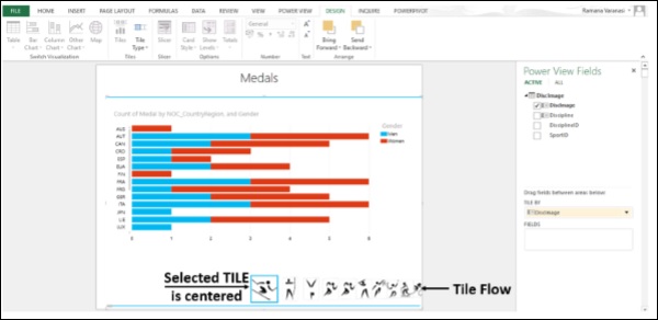
You can click on the Tiles or you can Scroll through the Tiles by using the Scroll Bar. When you Scroll, the Tiles go on being selected.
Step 7 − Click on Map in the Switch Visualization group.
Step 8 − Drag Medal to Color.
Step 9 − De-select the Field Gender
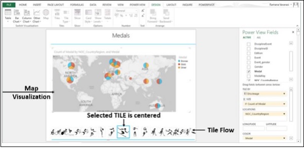
You got Map Visualization with Tile Flow. Likewise, you can have any data visualization with Tiles.
No comments:
Post a Comment